
01 · F&B Brand Identity
Uncle Crunchy
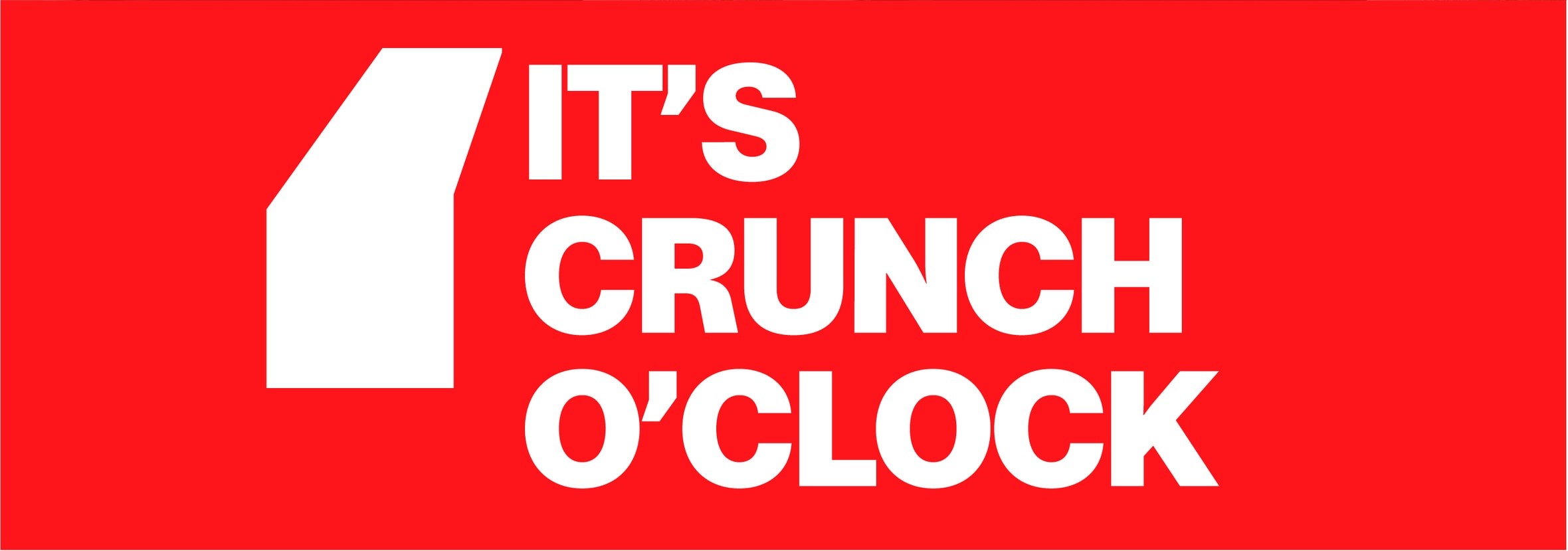
It's Crunch O'Clock! — a louder, sharper fried-chicken identity.
Overview
Uncle Crunchy is more than a restaurant — it's a memorable food experience built around flavour, texture and energy. The identity was created to challenge ordinary fast-food with something louder, stronger and more exciting.
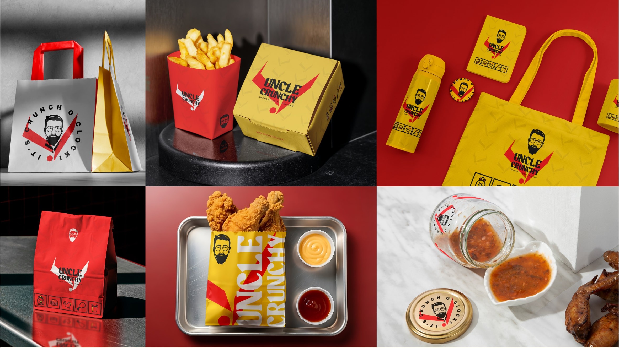
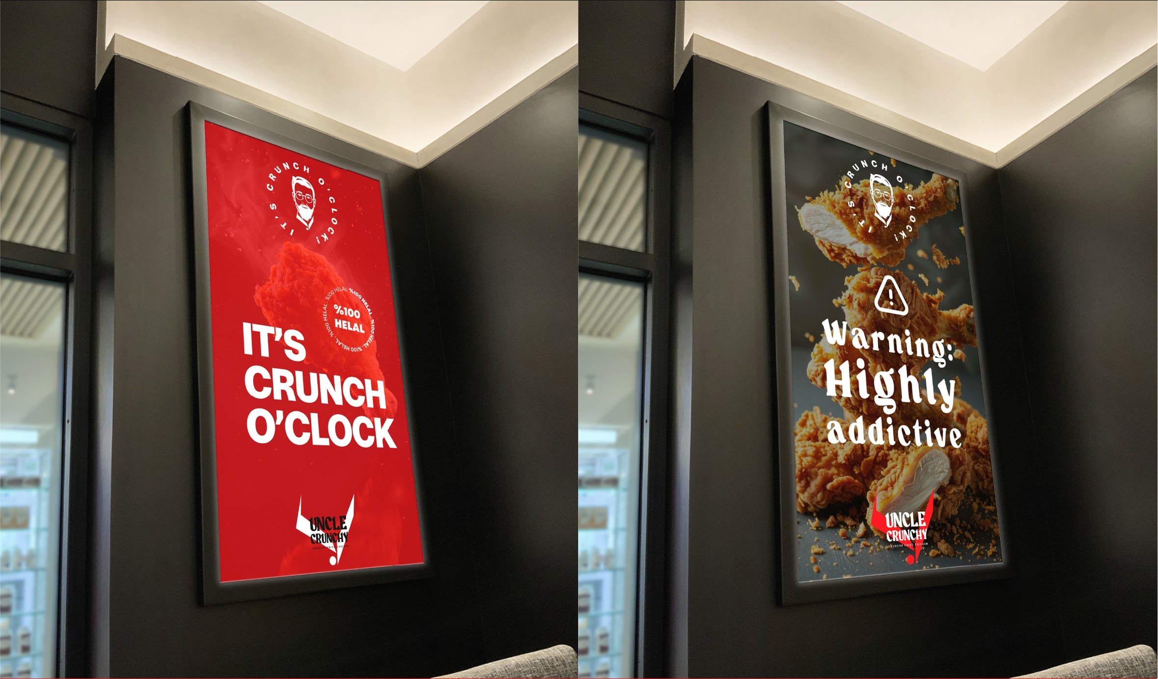
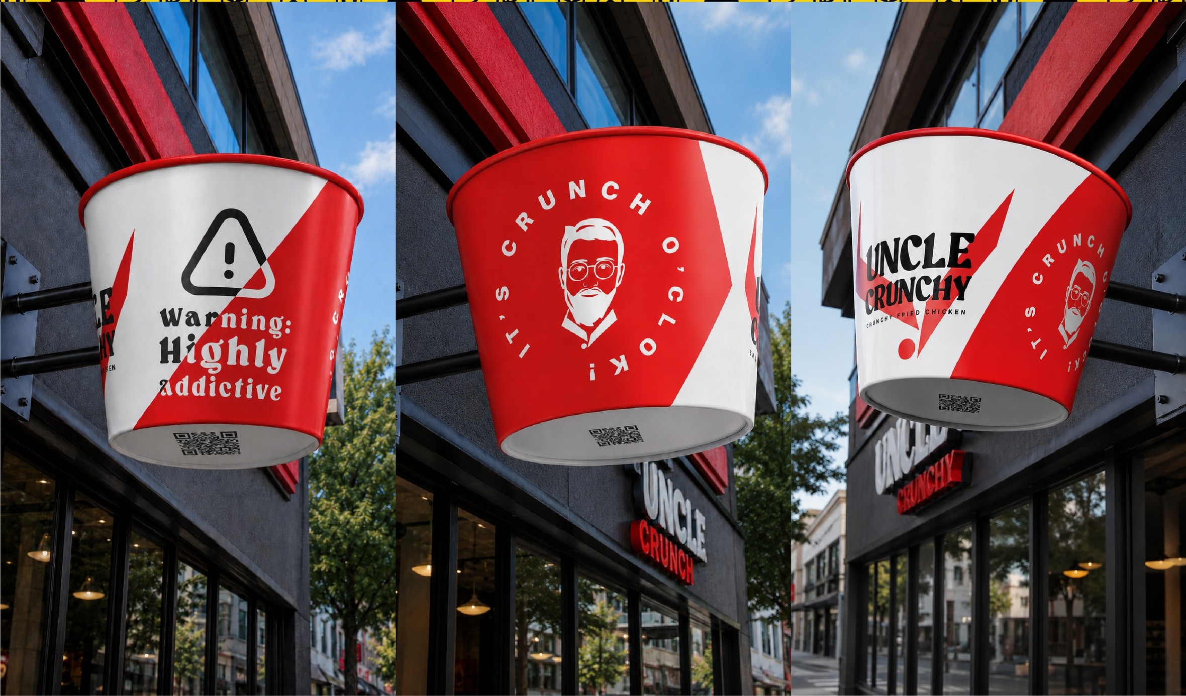
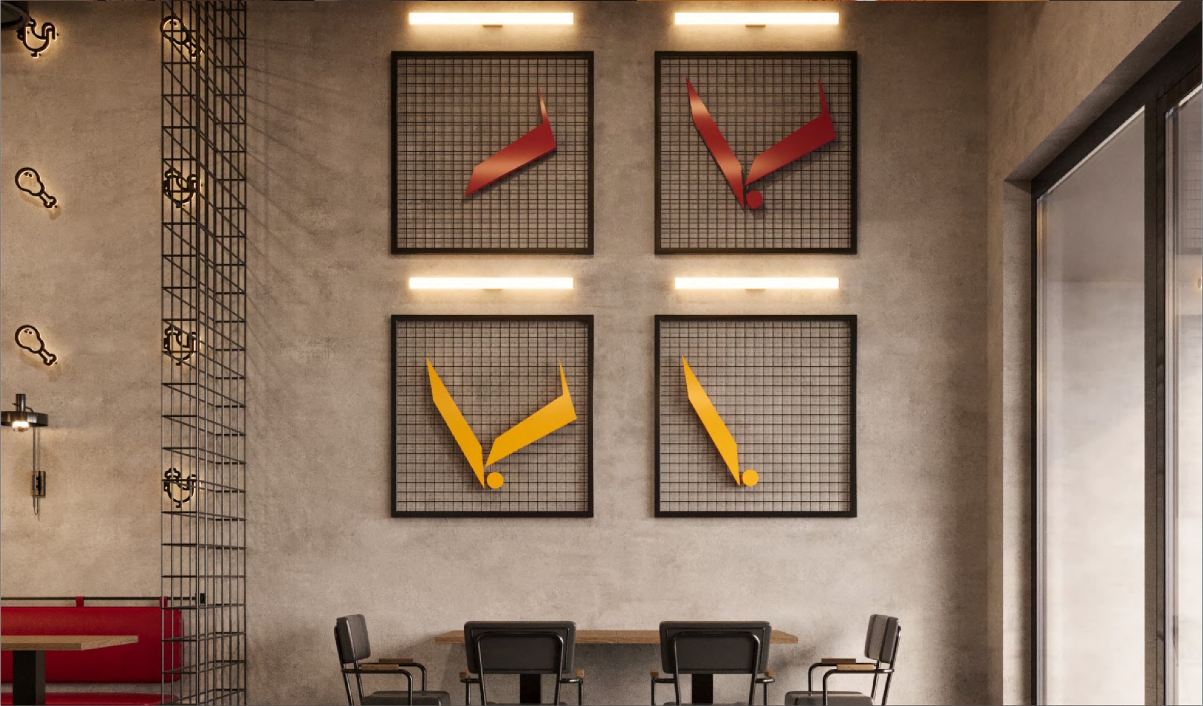
A bold red-and-gold system anchored by a sharp ‘V’ mark and heavy display type. Every touchpoint — packaging, signage, icons and social — is built to feel premium, recognisable and ready to share.
Logo

A hand-drawn rooster crest paired with a bold custom wordmark — an all-white mark that stays crisp from signage down to the app icon.
Deliverables
Logo & VariationsColour SystemTypographyPackagingIconographySocial Media
Brand Voice
BoldCrave-worthyEnergeticPlayfulUnapologetic
Palette
Typography
Aa
Display Archivo Black Logo & headlines
Aa
Text Archivo Body & packaging copy
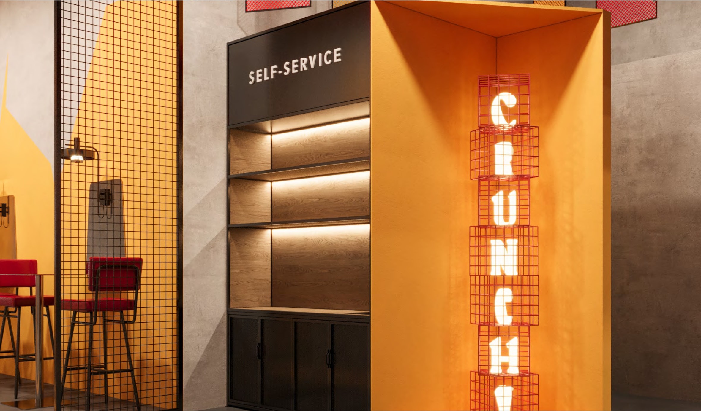
The system, in the wild



Next project
Farouj